I designed a logo for Rouge Rocks, a new brand specializing in apparel, makeup, and accessories for primarily female musicians. The client wanted to leverage her knowledge of the music industry and experience appealing to musicians to create a place where women would feel comfortable shopping. It also needed to be adaptable to many formats from apparel to engraved phone cases.
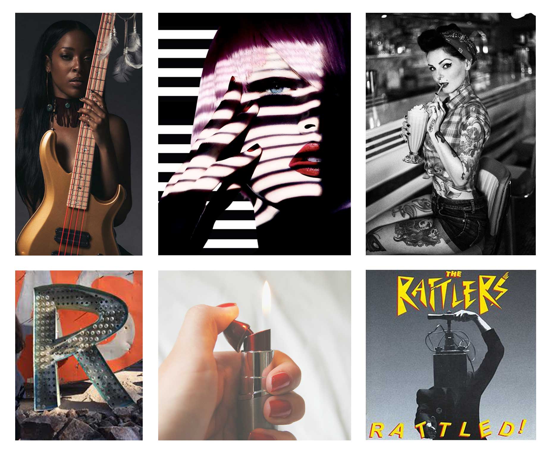
We concluded the logo needed to be universal, simple, empowering, and glamorous. After discussing everything from vintage rockabilly music to Sephora I developed a mood-board representing the most important points of inspiration.
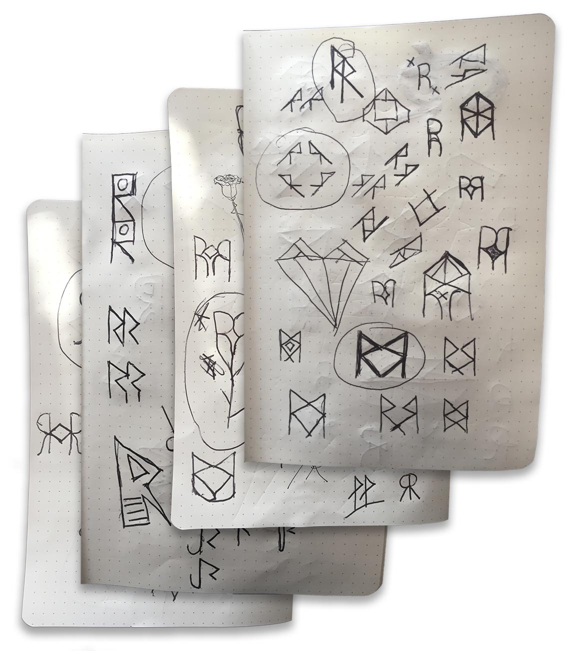
Sketches
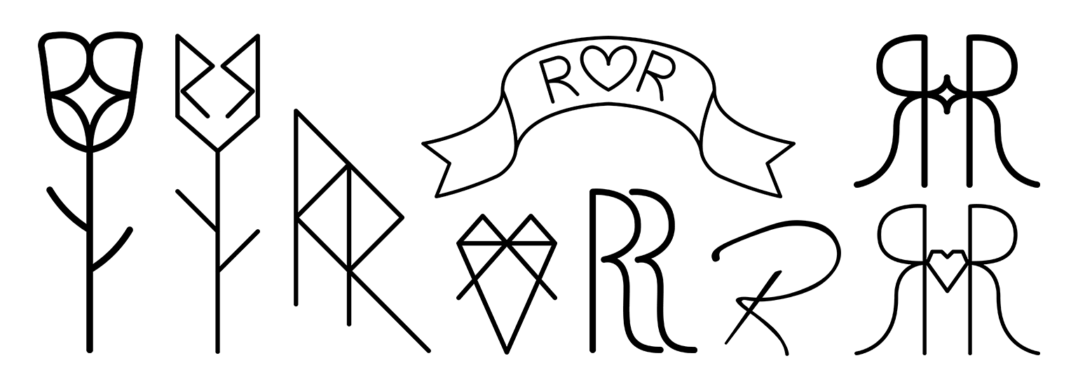
After filling a sketchbook of possibilities I selected the ones that fit the brand best and translated them into higher fidelity digital versions. The simple geometric designs would be easily adaptable in different contexts and the tattoo inspired designs spoke to the empowerment of rock music.
Symbol Design
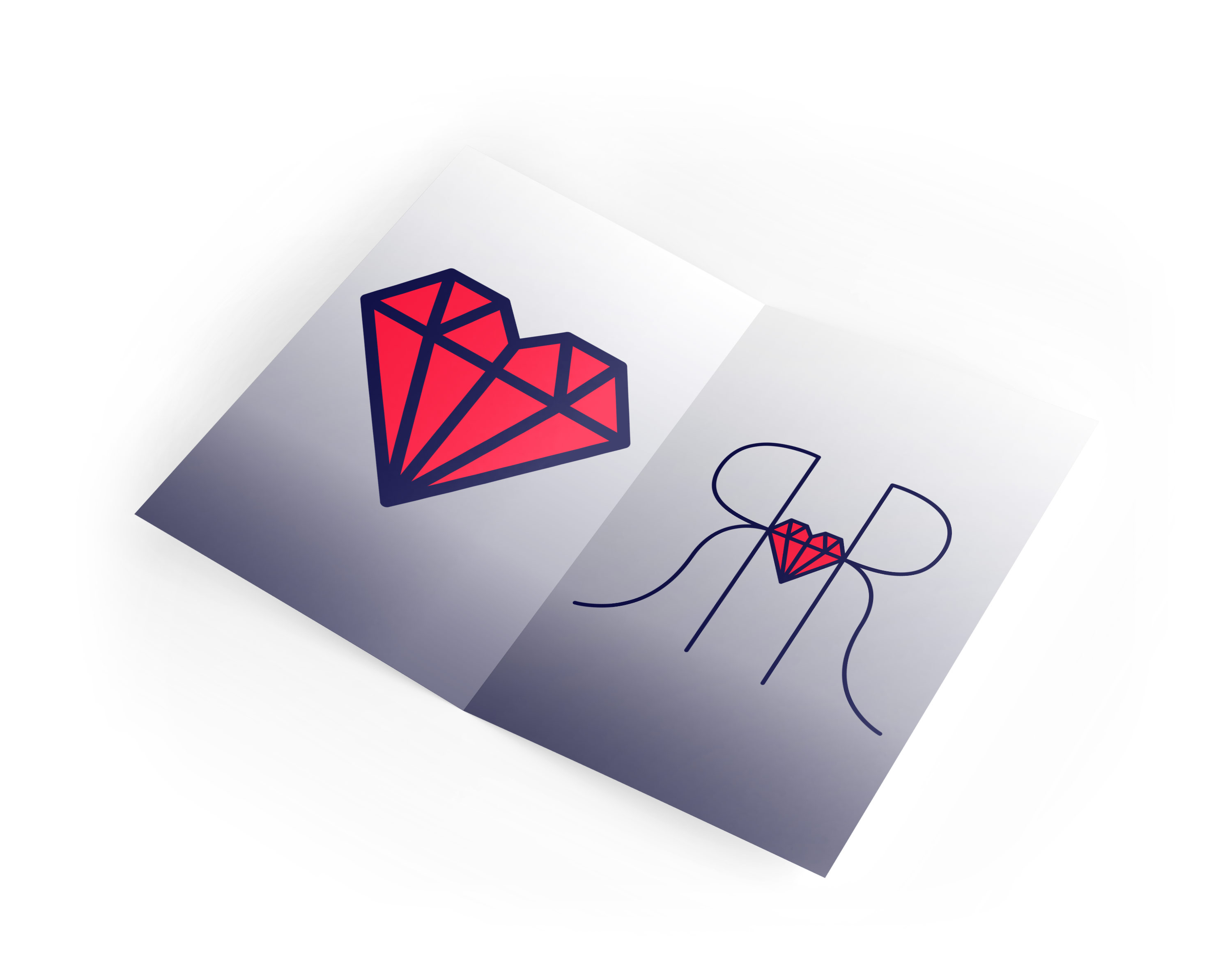
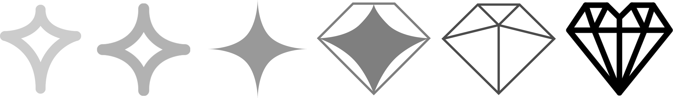
The client immediately felt the mirrored double Rs with the symbol in the middle was the strongest. We decided to experiment with the inside symbol. Basic star shapes and empty hearts were too generic so I combined the heart with a gem for a more geometric effect.
Final Result
The combination of the diamond symbol with the mirrored R’s was our favorite design. The shape of the letters and focus on the diamond felt regal without being pretentious, and recalled playing card or tattoo designs.